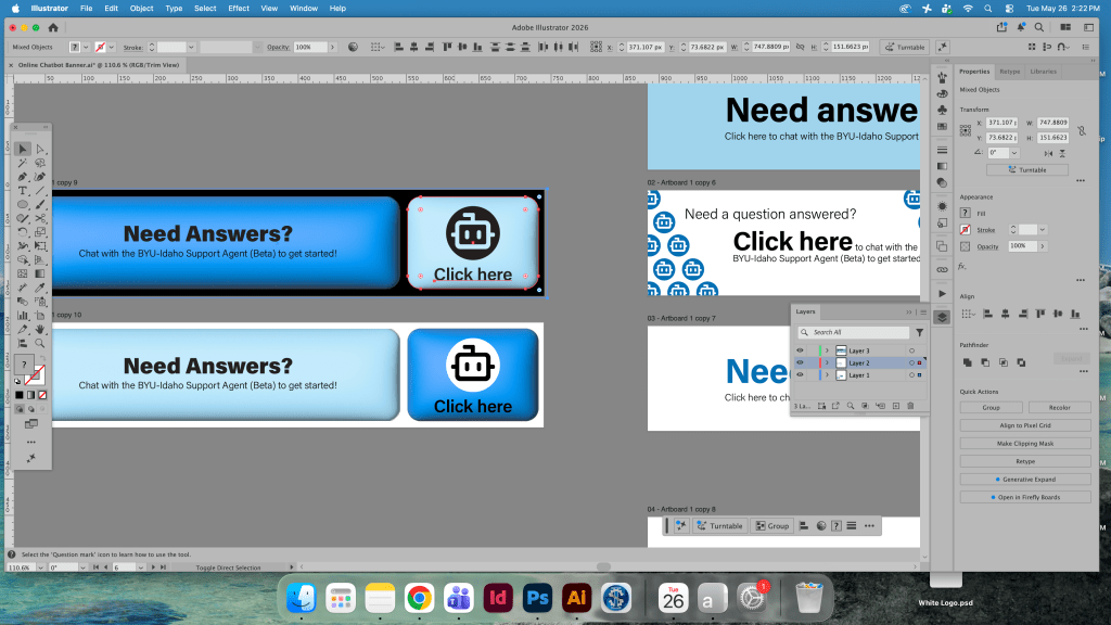
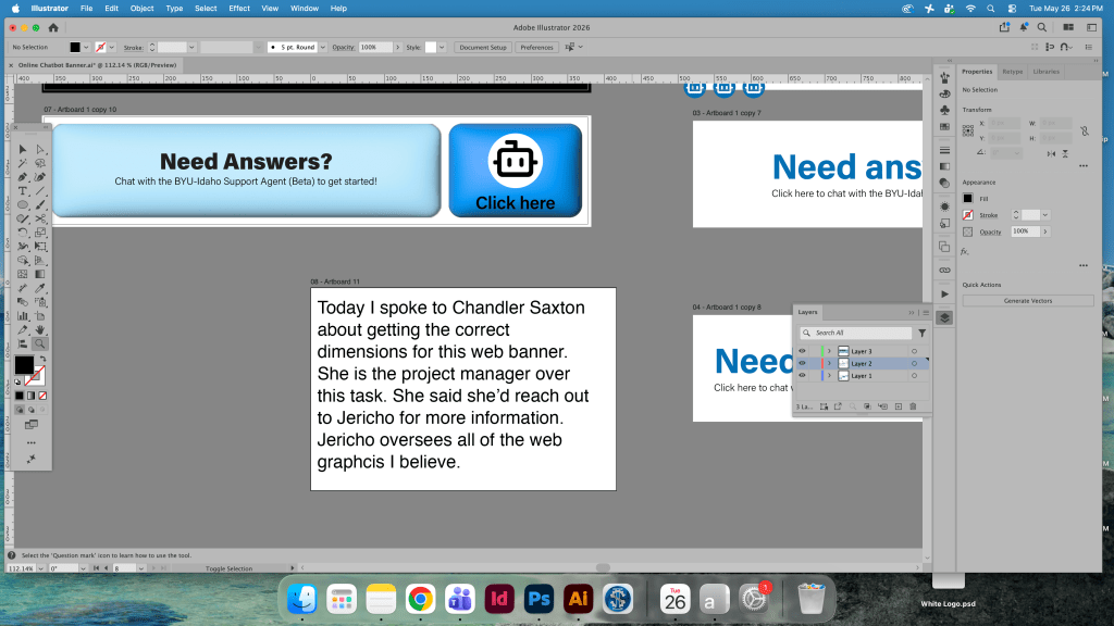
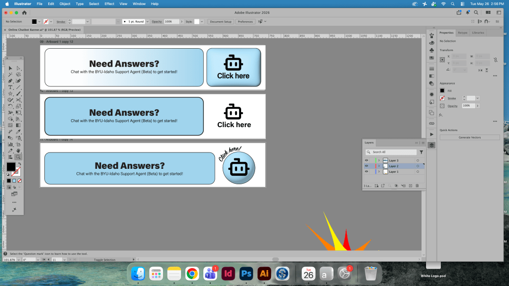
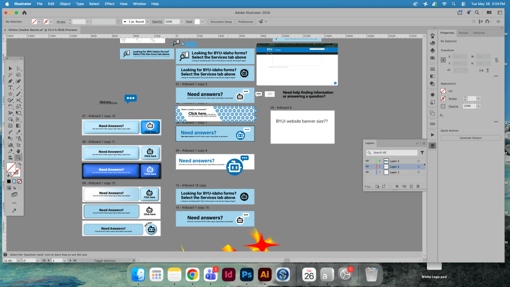
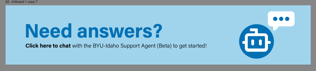
Starting this week I created a great deal of designs for the chatbot web banner, a lot more iterations than previously. Something that I find I do often during the design process is make many iterations of something and go off into aesthetic tangents often as well. If I feel I want to explore a design direction or new route the visual could take I typically take that and see where that path will lead. With the web banner I chose to go for a retro 3D look, hoping that this kind of thing could be approved. I mainly liked it because it seemed to represent a good signifier of “this is a button to be pushed” as users were able to click the banner to lead to our new chatbot. I’ve also coordinated with project managers and specialists on this one to get the right dimensions and font usage. I also received a new task.


Leave a comment